Using pre-engagement form data and context in Webchat 3.x.x
When using chat as a communications channel for your contact center, you can use a pre-engagement form to gather relevant user information (such as name and email) before the start of a chat. Alternatively, you can gather relevant context from the data you already have, such as a user's login name or HTTP referrer. You can use pre-engagement form data and context for routing the task to the right agent or displaying relevant user information to the agent.
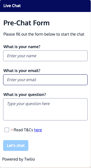
The default pre-engagement form collects the user's name, email address, and query, which are considered to be personally identifiable information (PII). You can configure the pre-engagement form to collect additional information.
To initiate a chat with a pre-engagement form, a user's friendlyName and query must be set. The friendlyName attribute is set to "Anonymous" in the context object of your default Webchat configuration. The friendlyName and query values are displayed to the agent in the Flex UI. When set in both the Webchat context object and a pre-engagement form, the pre-engagement form value overrides the context object value.
This section explains how to customize your pre-engagement form to collect the most important data from your customers.
The pre-engagement form is enabled by default. If you want to turn off the pre-engagement form, set disablePreEngagementForm: true in your Webchat configuration.
The following example form shows many types of input fields, including required and optional input fields, a required checkbox for customers to acknowledge terms and conditions, and a submit button with the label "Let's chat." While this example shows many types of fields that you might want to use, we recommend limiting your pre-engagement form to 3-5 fields to avoid overwhelming your customers. However, there is no limit on the number of fields that you can include.
1const appConfig = {2// Webchat Config3deploymentKey: "{your_key}",4appStatus: "open",5theme: {6isLight: true7},8context: {9locationOrigin: window.location.origin,10someContextProp: "ContextProp1",11},12disablePreEngagementForm: false,13preEngagementConfig: {14title: "Pre-Chat Form",15description: "Complete this form to start the chat",16submitLabel: "Let's chat",17footerLabel: "Powered by Twilio",18fields: [19{20label: "Name",21type: "InputItem",22attributes: {23name: "friendlyName",24type: "text",25placeholder: "Enter your name",26required: true,27pattern: "^[a-zA-Z]+(([',. -][a-zA-Z ])?[a-zA-Z]*)*$",28readOnly: false,29value: "Bob"30}31},32{33label: "Email address",34type: "InputItem",35attributes: {36name: "email",37type: "email",38placeholder: "Enter your email address",39required: true,40readOnly: false,41value: "bob@example.com",42pattern: "{Your_email_pattern}"43}44},45{46label: "Date of birth",47type: "InputItem",48attributes: {49name: "dob",50type: "date",51placeholder: "Enter your date of birth",52required: false,53readOnly: false,54pattern: "{Your_date_of_birth_pattern}"55}56},57{58label: "Phone number",59type: "InputItem",60attributes: {61name: "phone",62type: "tel",63placeholder: "Enter your phone number",64required: false,65readOnly: false,66value: "0123456789",67pattern: "{Your_phone_number_pattern}"68}69},70{71label: "Ask a question",72type: "TextareaItem",73attributes: {74name: "query",75type: "text",76placeholder: "Type your question here",77required: true78}79},80{81label: "Question category",82type: "SelectItem",83attributes: {84name: "Question category dropdown",85required: false,86readOnly: false87},88options: [89{90value: "value1",91label: "label1",92selected: false93},94{95value: "value2",96label: "label2",97selected: true98}99]100},101{102label: "Agree to our terms and conditions",103type: "CheckboxItem",104attributes: {105name: "termsCheckbox",106required: true,107refLink:108"<span>Review our <a href='{Your_link_here}' target='_blank'>terms and conditions</a></span>"109}110}111]112}113}

The following attributes are available for your pre-engagement form:
| Form attribute | Description |
|---|---|
title | Name or greeting that appears as the heading at the top of the form. |
description | Introductory text for the form. |
submitLabel | Label that appears on the button to submit the form. |
footerLabel | Optional text that appears at the bottom of your form. |
| Field setting | Description | Applies to these field types |
|---|---|---|
label | Name of the field. | All field types |
type | The following field types are supported:
| All field types |
options | Add an array with value, label, and selected elements for each option that users can select. To set a default value, set selected: true for that option. | SelectItem |
For the input area of each field, you can set the following attributes and validations:
| Input attribute | Description | Applies to these field types |
|---|---|---|
name | Name of the input. | All field types |
type | Format of the input that the user can enter and method of entry:
| InputItem, TextareaItem |
placeholder | Example text that appears in the field and disappears when the user begins typing. | InputItem, TextareaItem |
required | Validates whether a form field is required or optional. Can be set to true or false. | All field types |
pattern | Checks the validity of the input item against the pattern you specify. Enter the expected pattern as a regular expression (regex). | InputItem |
readOnly | Determines whether the field can be edited. Set to false in most cases. When set to true, the field can't be edited but can receive focus to allow users to highlight the text in the field. You may want to set a default value with the value attribute. | All field types |
disabled | Similar to readOnly, except that this attribute can be dependent on the value entered in another input field. For example, if your form asks whether the chat is about an existing order, you could enable an order number field only if the customer has answered yes. | All field types |
value | Default field value. This is typically used with readOnly fields. | All field types |
refLink | Descriptive text that optionally includes HTML formatting, such as links. A common use case is to include a checkbox to acknowledge terms and conditions, with a link to your terms and conditions webpage. | CheckboxItem |
You can use context data to pass additional information, beyond pre-engagement form details, to the Flex platform when a webchat is initiated. This information enables you to provide a more personalized and informed interaction between your customers and your agents.
To get started, configure the context object in your Webchat configuration. For an example, see the context section in the example pre-engagement form and context section above.
When enabled, pre-engagement form and context data are both automatically saved as Conversations attributes (for example, conversation.ChannelAttributes.pre_engagement_data) when a chat is initiated.
Your form and context data can then be accessed in the Studio chat flow. See the Studio documentation to learn more about how Studio uses variables.
An incoming chat conversation triggers the Webchat flow for your Flex instance, which you can customize within Twilio Console.
In the Studio chat flow, you can:
- Trigger a bot conversation based on gathered pre-engagement data
- Use pre-engagement data for decisions in the flow, like when to send the conversation to an agent
- Add pre-engagement data to task attributes for routing decision or information display to an agent in Flex
Studio uses Liquid syntax to access the pre-engagement data in a Studio widget. For example, here's how you would access the question attribute from your pre-engagement form data:

"{{trigger.conversation.ChannelAttributes.pre_engagement_data.question}}"
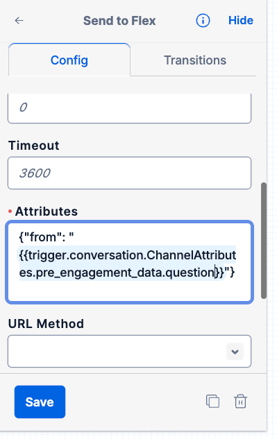
Here's how you would add the initial user question to your chat task attributes in the Send To Flex widget:
{"initial_question": "{{trigger.conversation.ChannelAttributes.pre_engagement_data.question}}"}