React vs. Svelte: Comparing the Basics
Time to read: 10 minutes
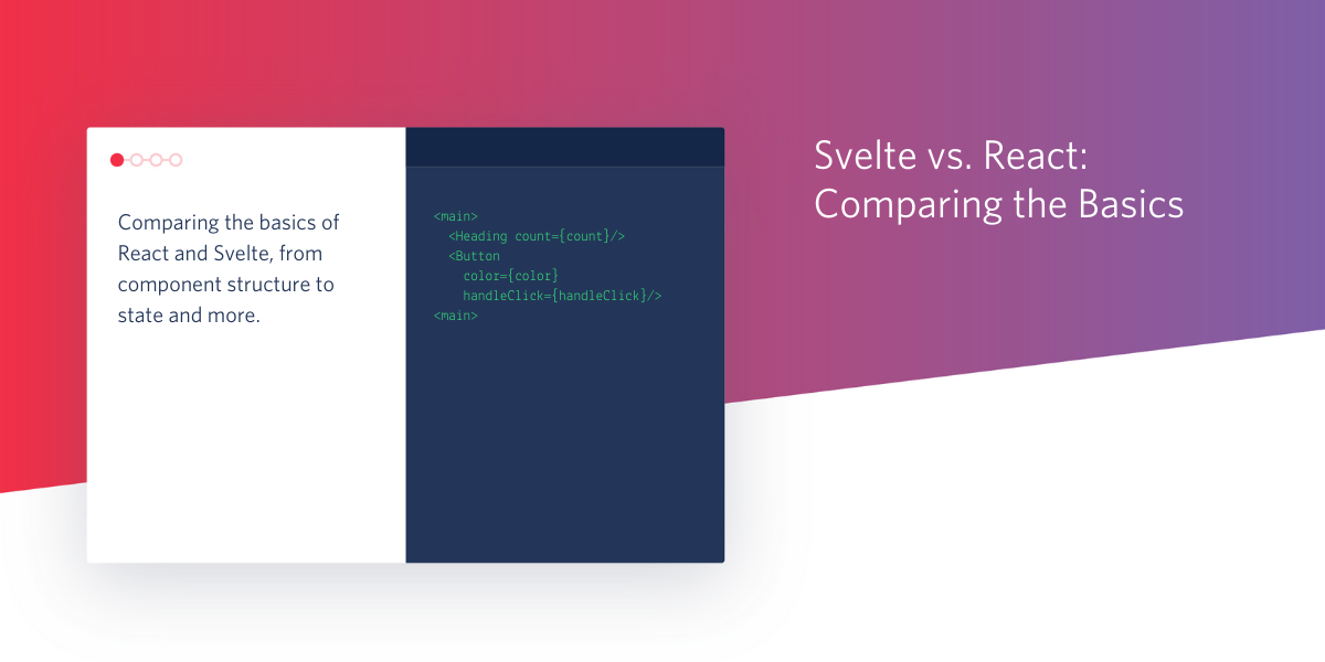
When it comes to JavaScript frameworks, Svelte is the new kid on the block. I’ve been hearing a lot of buzz about it, so I decided to give it a try and see how it feels compared to React.
This article is going to talk a little bit about the differences between Svelte and React, and then show you how to build a basic app with both frameworks. The goal is to demonstrate a few core concepts that cover:
- Structuring components
- Initializing state
- Passing props
- Lifting state
- Event listeners
- Dynamic styling
There’s a lot more to discuss, including conditional rendering, lifecycle methods, and other cool concepts, but for this article I’ll focus on the basics and give my gut check feeling along the way.
Prerequisites
To get started with this tutorial, you should have the following tools and technologies ready to go:
- npm or yarn
- Node.js installed on your machine
- If you’re using VS Code, you might want to snag this Svelte extension
Svelte vs. React
Both Svelte and React.js are component-based JavaScript frameworks for web application development. Their main difference is that Svelte doesn’t use a virtual DOM. It will compile your code down to vanilla JavaScript at build time, whereas React interprets your code at run time.
According to the Svelte documentation:
Svelte is a radical new approach to building user interfaces. Whereas traditional frameworks like React and Vue do the bulk of their work in the browser, Svelte shifts that work into a compile step that happens when you build your app.
Instead of using techniques like virtual DOM diffing, Svelte writes code that surgically updates the DOM when the state of your app changes.
Cool! But the behind the scenes details weren’t as important to me during this investigation. I wanted to look at this from a developer experience perspective. What is it like to write Svelte versus React? Does it feel nice? Is it fun? Is it intuitive?
Let’s find out.
Scaffold your app
In this tutorial comparison, you’re going to be building a small app with the following requirements:
- Three components:
App,Heading, andButton - Every time the button is clicked, the heading will update with the current click count
- Every time the button is clicked, the color of the button will change
Create a new directory on your computer called svelte-react using the following commands:
Your next step is to scaffold boilerplate Svelte and React apps and run them locally. Svelte’s setup process has one more step than React’s does. Your Svelte app will also run on PORT=5000 as opposed to React’s PORT=3000.
Svelte
In your terminal or command prompt window, run the following commands:
React
Open a second terminal, and navigate back to your new svelte-react parent directory. From there, run the following commands:
You’ll notice that the Svelte commands ran a lot faster - that’s because with Svelte, you’re not really running a utility, you’re cloning a template.
Build the App component
After running the commands above, you’ll see that both your Svelte and React starter apps have a lot of files and code already. Feel free to explore these files.
Component files for both Svelte and React projects should be placed inside the /src folder. If you look inside the provided /src folders, you’ll see that Svelte files end in the .svelte extension, whereas React component files end in .js.
Each starter app came with an App component, located at svelte-react/svelte-test/src/App.svelte and svelte-react/react-test/src/App.js. Open each of these files in your preferred code editor and delete the code inside both of them. You’ll start fresh with new code.
Component structure
Svelte
Unlike React components, Svelte components allow you to write code in a way that feels a lot more like writing the HTML, CSS, and JavaScript of yore.
All the JavaScript for your component goes inside <script></script> tags at the top of the file.
Below the <script></script> tags, you can write the HTML for your component. Yep - it’s just there, like in a regular HTML document. Whoa.
Then, below your HTML, you can add styles inside <style></style> tags. Fun fact, the styles in each component are scoped only to that component. That means, for example, you can style <p> tags differently in every single component, and the styles won’t override each other on import.
To get started with App.svelte, delete everything inside the file, and add some empty <script> tags:
The bulk of the code for your component is going to go inside these <script> tags.
React
In your React app, open your App.js file, delete the contents, and add the following:
This code creates a basic functional component called App() and then exports it. Note another key difference between Svelte and React here - in Svelte, you don’t export your components.
Imports
As described earlier, this app will have three components App, Heading, and Button. In both the Svelte and React apps, the Heading and Button components are imported into App so they can be used as child components inside the App component. You’ll write these components later on, but for now, know that you’ll reference them as you build out the App component.
Svelte
In Svelte, you add your imports inside the <script> tags. Edit your App.svelte file to reflect the highlighted lines:
React
Your imports in React go at the very top of the file, before your function (or class) component. At the very top of App.js, before your App() function, add the following code:
In the case of React, you’re also importing the useState hook, because App is a stateful component. There is no analog for this hook in Svelte - you don’t have to import anything.
Initialize state
App is a stateful component. It will have two state values: color and count.
color is the color of the button. This value is passed as props to the Button component, and it changes every time the Button component is clicked. It will be initialized with a value of #000000, which is the hex code for the color black.
count represents the number of times the Button has been clicked. It will be initialized with a value of 0.
Svelte
In Svelte, state is created by assigning variables. Beneath your imports, inside the <script> tags, add the following state declarations:
Svelte also offers something called reactive declarations, which lets you recompute a state value. You don’t have to use these, but it’s very helpful if you’re using a state value that’s derived from other state values that are subject to change.
Something to note is that DOM updates in Svelte are triggered by assignment of state variables. If your state includes arrays or objects, updating them using methods like .push() won’t trigger a DOM update. Svelte details how to manage this in its Updating arrays and objectsdocumentation.
React
You’ve already imported the useState hook, so now it’s time to put it to action.
Inside your App() function, in App.js, add the following state declarations:
This code creates a state variable called count with an initial value of 0, and a method to update that value called setCount(). Likewise, it creates a state variable called color with an initial value of #000000, and a method to update that value called setColor(). At this point, Svelte’s state initialization feels a lot easier to read and use.
Render the component and pass props
In both projects, your goal is to create a user interface made up of a <main> element that wraps your two nested components: Heading and Button.
The App component is passing props to both of these child components. The Heading component receives the count state value, and the Button component receives the color state value, in addition to a handler function called handleClick() that you’ll write shortly.
Svelte
Svelte uses its own templating language to create your user interface and React uses JSX to accomplish the same thing. Svelte’s templating language feels very akin to writing HTML templates in a server-side environment, like with Flask, PHP, or Liquid. This article won’t cover the details, but what’s nice is that you can get started by writing HTML directly in-file, beneath your <script> tags.
Copy and paste the highlighted code in your App.svelte file, beneath your <script> tags:
React
Back in App.js, copy and paste the following code inside your App() function, below the state declarations.
This code returns the JSX for your user interface from your App() function.
This is where Svelte and React look most similar - passing props happens in exactly the same way. In this example, Svelte’s templating looks exactly the same as React’s JSX.
For React developers curious about Svelte, you won’t find anything surprising or new in regard to passing props. Receiving props, on the other hand, is slightly different in Svelte, but I’ll touch on that later on this post.
Lift state
For this app to work, everytime the Button is clicked, the App component’s count state value must be increased. That means you’ll need a mechanism for lifting data from the child component back up to the parent.
You already started this process in the previous step by passing the handleClick() function to the Button component as props.
This function, which you’ll write now, belongs to the App component. When you pass it as props to the child Button component, the Button component has access to it, and can call it every time the button is clicked. This is how the App component can become aware of what’s happening in its child component.
This function is responsible for updating the App component’s count and color state values.
Svelte
In App.svelte, copy and paste the following code inside your <script> tags, after the state declarations:
React
In App.js, copy and paste the following code inside your App() function, directly above the return statement:
In React, you’re required to use the setCount() and setColor() methods that you declared earlier to update the state values, whereas you can update them directly in Svelte.
That concludes your work in the App component. Now it’s time to move on to the Heading component.
Build the Heading component
The Heading component shows the app’s heading text and the click counter. It’s not a stateful component, and it receives one piece of data as props: count, representing the number of times the button has been clicked.
Inside the Svelte project’s src folder, create a new file called Heading.svelte.
Inside the React project’s src folder, create a new file called Heading.js.
Receive props
Svelte
Inside your new Heading.svelte project, copy and paste the following code:
Take a look at the highlighted line inside the <script> tags. This line indicates to Svelte that the component will be receiving a prop called count.
This enables you to use count directly inside your Heading component’s HTML template, as you can see on line 6 above.
Writing this felt a little weird, but having the props declared immediately at the top of the file does look nice, and I like being able to use the prop directly.
React
Switch to your new Heading.js file. Copy and paste the following code into this file:
This code creates a new functional component called Heading, that has one parameter: { count }, which is the count value destructured from the props object passed to the component.
Build the Button component
The Button component renders the <button> element on the UI. This component receives two props: color, which it will use to style the <button> element, and handleClick(), the function that will be called whenever the <button> element is clicked.
Inside the Svelte project’s src folder, create a new file called Button.svelte.
Inside the React project’s src folder, create a new file called Button.js.
Listen for events
Listening for interactive events like clicks and other mouse events is a slightly different process in Svelte and React. This section will demonstrate both.
Svelte
Copy and paste the following code into Button.svelte:
In this code, both props are declared at the top of the file in the <script> tags.
Then, it creates the <button> element. You’ll notice there’s some new looking syntax on line 6. Ignore the style part for now, I’ll explain that in the next section. But checkout the syntax for the click event listener: it’s different from what you might be used to.
Svelte uses an on: directive to add event listeners to DOM elements. Svelte also has really neat event modifiers that allow you to, for example, only trigger a click event on the first click. You can also dispatch your own component events.
React
Add the following code inside Button.js:
If your server is still running and you see an error at this point, don’t worry, you’ll be adding the styles object shortly and the error will be fixed.
The code above creates a new functional component called Button() that receives one argument, props, destructured into color and handleClick. The handleClick() function is available on the handleClick props, and you can use a standard inline onClick event on the <button> element JSX.
Dynamic styling
In this app, the Button component is receiving a color as props. This color value will become the background color of the <button> element.
Svelte
Dynamic styling is certainly possible in Svelte, but it’s less straightforward than I expected.
Unfortunately, you can’t use prop values directly inside your <style> tags in Svelte. You can, however, use the component’s HTML as a way to communicate between your JavaScript and your CSS.
Beneath your Button component’s HTML, at the end of the file, copy and paste the following styles into Button.js:
The background-color style property isn’t referencing the color props directly, it’s referencing a style variable called color that you created on the <button> element in the HTML in the previous section.
This is a little cumbersome, but the trade-off is getting to write real CSS that’s automatically locally scoped. (Don’t worry, you can have global CSS too).
React
In React, you can add styles to your component multiple ways, and specifically, inline styles are used most commonly for dynamic styling.
To use inline styles in your JSX, you can create an object with your styles, and then assign this object to the style attribute on your element, the latter of which you already did in the previous section.
Inside your Button() function, before your return statement, copy and paste the following code to create your styles object:
Test the apps
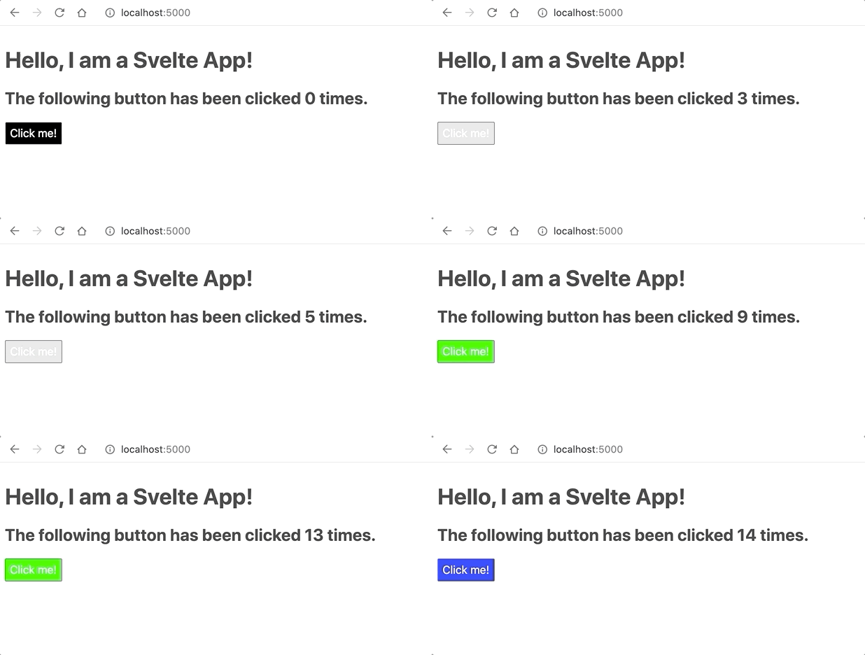
Save and close all your files. If your project servers aren’t still running, restart them now (npm run dev for Svelte, npm start for React). Then, visit localhost:5000 in one browser tab, and localhost:3000 in a second browser tab.
Once you have each of the apps running, click the button and see the heading update its count as well as the button color change.
Svelte
React
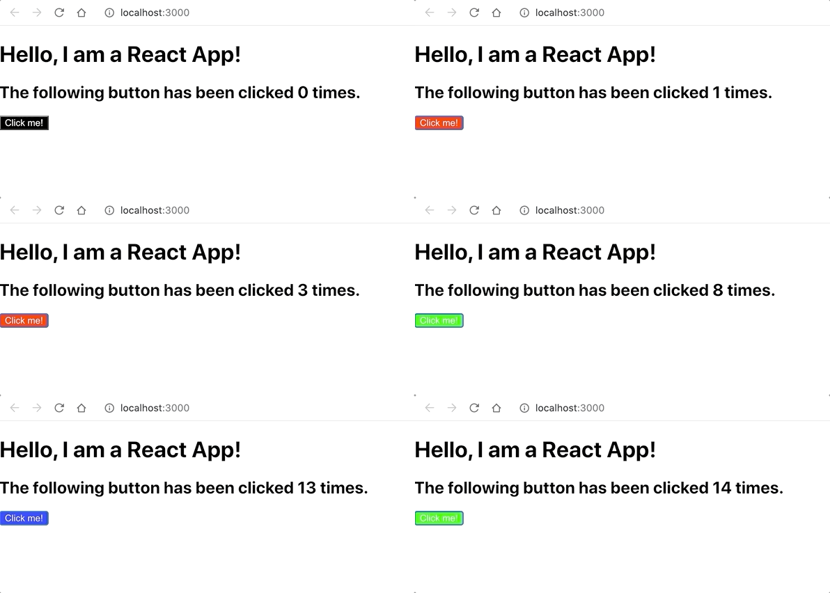
Svelte and React seem to have a few differences in their native styling for margins, padding, and buttons, but all in all, you built two identical apps in two different frameworks. What did you think? How did it go?
Conclusion
This was a really fun exploration of Svelte. So far, the capabilities of Svelte and React seem similar. Svelte’s templating language is very intriguing, particularly the on: directive, and I won’t lie, I miss writing templated HTML. I’m definitely going to build more with Svelte, and I look forward to diving into more advanced concepts like lifecycle methods and data binding, which right now is a pain in React.
Let me know how you liked working with Svelte on Twitter!
Ashley is a JavaScript Editor for the Twilio blog. To work with her and bring your technical stories to Twilio, find her at @ahl389 on Twitter. If you can’t find her there, she’s probably on a patio somewhere having a cup of coffee (or glass of wine, depending on the time).
Related Posts
Related Resources
Twilio Docs
From APIs to SDKs to sample apps
API reference documentation, SDKs, helper libraries, quickstarts, and tutorials for your language and platform.
Resource Center
The latest ebooks, industry reports, and webinars
Learn from customer engagement experts to improve your own communication.
Ahoy
Twilio's developer community hub
Best practices, code samples, and inspiration to build communications and digital engagement experiences.
