HTML attributes to improve your users' two factor authentication experience
Time to read: 4 minutes

There are plenty of opportunities for friction in the user experience when logging in, particularly while entering a two factor authentication code. As developers we should be building applications that support the need for account security but don't detract from the user experience. Sometimes it can feel as though these requirements are in a battle against each other.
In this post we will look at the humble <input> element and the HTML attributes that will help speed up our users' two factor authentication experience.
The default experience
When you implement two factor authentication for a web application, perhaps with the Authy two factor authentication API, you will need a form for your user to input the one time password you are going to send them. You might create something similar to the following HTML:
This is a good experience already. The <input> has a name and a unique ID and the <label> is using the correct for attribute to explicitly associate with it, which is important for accessibility. You could also wrap the <label> around the <input> for the same effect. With a bit of CSS, this might look something like this:
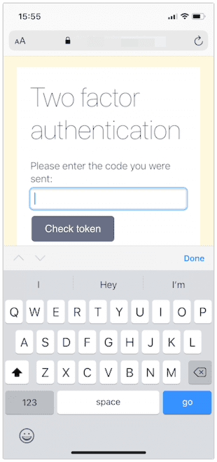
However we can progressively enhance this experience with just a few more attributes.
Getting the right keyboard
On mobiles or devices with on-screen keyboards the first thing to notice is that we are presenting the full alpha-keyboard. One time passwords are made of numerical characters so it would be much better to present the user with a number pad.
You might think that switching the type of <input> from "text" to "number" is the solution here:
You would be wrong though. This does trigger a different keyboard on iOS, but it still includes a number of useless keys.
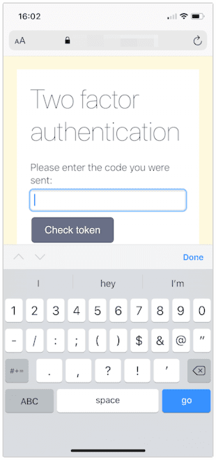
Changing the type of field changes the way the browser interprets that field. It could cause errors too; if the two factor authentication code starts with a zero a number field may drop that leading zero.
inputmode
The inputmode attribute changes the keyboard the browser should display without changing the meaning of the data the field collects. We want our <input> to receive text input, but from the numeric keyboard. So instead, add inputmode="numeric"
inputmode has a number of other values, including "tel" for telephone numbers, "email", "decimal", "url", "search" and "none" in case you want to render your own keyboard. This article on CSS Tricks has all the details you need for the different inputmodes.
Browser support for inputmode is good for mobile operating systems these days, but a couple of years ago it was in the wilderness. For older browsers there is another trick to trigger the numeric keyboard and include a bit of extra validation for free.
pattern
The pattern attribute allows you to validate the contents of an <input> using a regular expression. Using the pattern [0-9]* tells the browser that we only accept numbers in the field and also triggers the number pad in browsers without inputmode support.
Our HTML looks like this now:
And the keyboard is a much simpler numerical input:
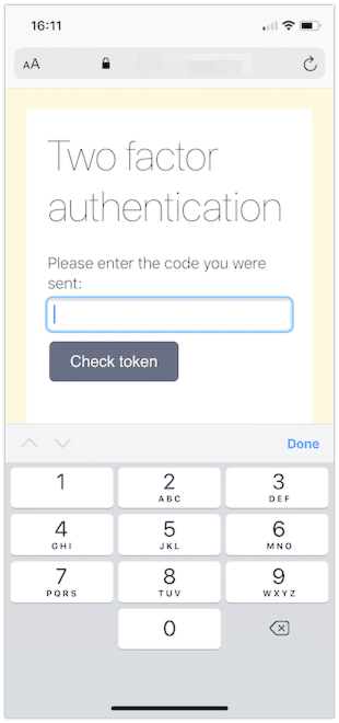
One thing that would make this form even easier to fill would be autocompletion of the one time password.
HTML autocomplete
According to MDN "autocomplete lets web developers specify what if any permission the user agent has to provide automated assistance in filling out form field values, as well as guidance to the browser as to the type of information expected in the field."
In iOS and Safari on macOS we can take advantage of this to have the browser suggest two factor authentication codes that are sent to the device over SMS. Adding the autocomplete attribute with the value "one-time-code" will trigger this behaviour.
With this, our <input> is complete and the experience for the user now looks like this:
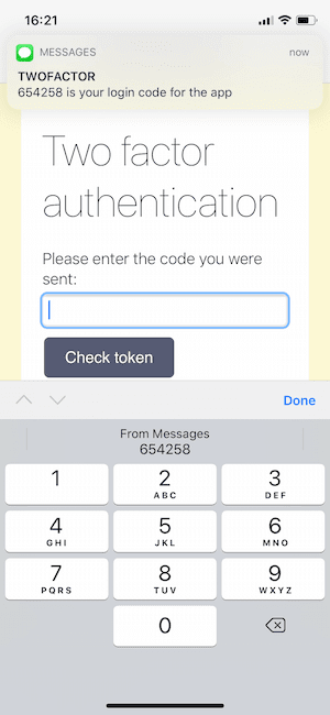
Other useful autocomplete values
There are many autocomplete values available, covering everything from names and addresses to credit cards and other account details. For sign up and login there are a few autocomplete values that stand out as useful hints: username, email, new-password, current-password.
Browsers and password managers have very good heuristics to find login forms on web pages, but using the username and current-password values make it very obvious. You definitely want to consider using these attributes if you are building a login form with the username and password on different pages.
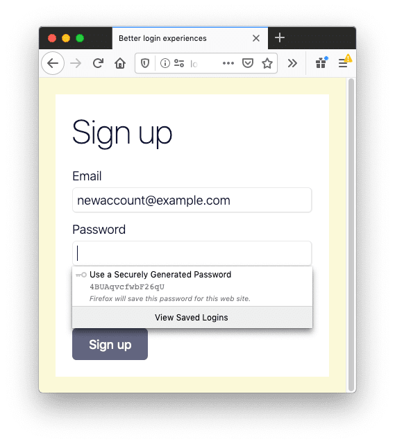
In a sign up form, make sure to use the "new-password" value as it triggers password suggestions in some browsers.
Autocompleting one time passwords in other browsers
This autocomplete behaviour only currently exists in Safari on iOS and macOS, but the Chrome team is investigating similar ideas to streamline this process. Currently there is an experiment with an imperative SMS Receiver API modelled on Android's SMS receiver API. This would allow developers to extract the one time password from the SMS and, because it's in JavaScript, instantly submit the form, saving the user more time.
At the time of writing this API is part of an origin trial which allows you to test it out and feed back to the Chrome team. If this interests you, sign up and give the API a whirl.
Better experiences through HTML
In this post we have seen that with just a sprinkling of HTML attributes we can improve the login experience for our users, particularly on mobile devices.
The <input> element is one of the most interesting HTML elements we have access to. Depending on the attributes it can be a text field, a range slider, a file selector a button and many more.
If you are looking for an even better two factor authentication experience, then take a look at Authy push authentication which cuts out the copying of codes entirely.
Do you have any other tips on improving the login experience for your users? I'd love to hear them in the comments below or hit me up on Twitter at @philnash.
Related Posts
Related Resources
Twilio Docs
From APIs to SDKs to sample apps
API reference documentation, SDKs, helper libraries, quickstarts, and tutorials for your language and platform.
Resource Center
The latest ebooks, industry reports, and webinars
Learn from customer engagement experts to improve your own communication.
Ahoy
Twilio's developer community hub
Best practices, code samples, and inspiration to build communications and digital engagement experiences.

