Create Dynamic Data Visualizations in Laravel with D3.js

October 23, 2024
Written by
Lucky Opuama
Contributor
Opinions expressed by Twilio contributors are their own
Reviewed by

Create Dynamic Data Visualizations in Laravel with D3.js

In today's fast-paced technological environment, where data flows in from every direction, it's more important than ever to have accessible ways to view and understand this data. One effective way to do so is with dynamic data visualizations.

In this tutorial, you'll learn how to create dynamic visualizations of the top five most populated countries by combining Laravel's exceptional data management capabilities with D3.js's sophisticated visualization techniques.

Understanding Data Visualizations

Data visualization is the practice of converting raw data into graphical or visual formats to make the information more accessible, understandable, and usable; as in the image above. It represents data using standard graphics like charts, plots, infographics, and even animations.

By leveraging your visual perception, data visualization, usually found on dashboards, has become a go-to tool for users to analyze and communicate information. These visual tools help reveal patterns, trends, and insights that might be difficult to discern from raw data alone.

In the world of Big Data, data visualization tools and technologies are important for analyzing vast amounts of information and making data-driven decisions. They provide a powerful means to present complex data to non-technical audiences clearly and effectively.

Benefits of dynamic data visualizations

Dynamic data visualizations provide numerous benefits, ranging from revealing hidden patterns and trends to making complex data accessible to everybody. These visual tools help you make better decisions and foster a data-driven culture, which enables you to act quickly and intelligently.

Let's look at the several benefits that they bring to the table.

  • Effective Communication: they clarify complex data for non-technical audiences through interactive charts and graphs, making information more accessible and easier to understand.
  • Enhanced User Engagement: they allow users to explore data interactively through hovering, clicking, and zooming, making the data more engaging, and help maintain user interest.
  • Improved Decision-Making: By presenting complex data sets interactively, they enable faster and more accurate decision-making, helping organizations respond swiftly to changing conditions.
  • Cost and Time Efficiency: Automating data updates, modifications, and dynamic visualizations saves time and money compared to manual data processing and static reports.
  • Scalability: they can handle big datasets, making them ideal for enterprises dealing with large volumes of data. They scale as the data grows, maintaining consistent performance and reliability.

Prerequisites

Create a Laravel project

To get started, let's create a new Laravel project. Open your terminal, navigate to the directory where you want to create the project, and run the following command:

composer create-project laravel/laravel data_visualization

Next, navigate to your newly created project by running the command below:

cd data_visualization

Then, to start your server, run the following command below:

php artisan serve

Now, open your browser and navigate to http://localhost:8000. You should see the default Laravel welcome page, confirming that the base application is ready, as shown in the screenshot below.

Create a model and migration table

Models and migrations are essential for defining and managing your database schema. The model represents your data, providing a convenient interface to interact with the database, while migrations allow you to create and modify database tables. Migrations are also essential for version control, ensuring your database structure is consistent and more easily manageable across different development environments.

To generate them for a country table, run the following command in a new terminal tab or session:

php artisan make:model Country -m

Next, open the migration file you just created (it ends with create_countries_table.php and is located in the database/migrations directory) and replace its content with the following code:

<?php

use Illuminate\Database\Migrations\Migration;
use Illuminate\Database\Schema\Blueprint;
use Illuminate\Support\Facades\Schema;

return new class extends Migration
{
    public function up()
    {
        Schema::create('countries', function (Blueprint $table) {
            $table->id();
            $table->string('name');
            $table->bigInteger('population');
            $table->string('color')->nullable();
            $table->float('latitude');
            $table->float('longitude');
            $table->timestamps();
        });
    }

    public function down(): void
    {
        Schema::dropIfExists('countries');
    }
};

The code above defines the table structure and outlines the functions for creating (up()) and dropping (down()) the table.

Next, run the command below to run the migration:

php artisan migrate

Now, navigate to app/models/Country.php and update the file to match the code below:

<?php

namespace App\Models;

use Illuminate\Database\Eloquent\Factories\HasFactory;
use Illuminate\Database\Eloquent\Model;

class Country extends Model
{
    use HasFactory;

    protected $fillable = [
    	'color',
    	'latitude',
    	'longitude',
    	'name',
    	'population',
    ];
}

As previously mentioned, the model provides an object-oriented interface for interacting with the database table and ensures that the attributes (color, latitude, longitude, name, population) can be mass-assigned, providing security and control over data manipulation operations.

Seed the database

With the database ready to go, let's now use the database seeder to quickly populate the database with sample data of the five top most-populated countries, to provide a consistent starting point.

To create a seeder run the command below:

php artisan make:seeder CountrySeeder

Next, navigate to database/seeders/CountrySeeder.php, open the file, and update with the code below:

<?php

namespace Database\Seeders;

use Illuminate\Database\Seeder;
use App\Models\Country;

class CountrySeeder extends Seeder
{
    public function run()
    {
        $countries = [
            ['name' => 'China', 'population' => 1412600000, 'latitude' => 35.8617, 'longitude' => 104.1954, 'color' => '#1f77b4'],
            ['name' => 'India', 'population' => 1366400000, 'latitude' => 20.5937, 'longitude' => 78.9629, 'color' => '#ff7f0e'],
            ['name' => 'United States', 'population' => 331002000, 'latitude' => 37.0902, 'longitude' => -95.7129, 'color' => '#2ca02c'],
            ['name' => 'Indonesia', 'population' => 273524000, 'latitude' => -0.7893, 'longitude' => 113.9213, 'color' => '#d62728'],
            ['name' => 'Pakistan', 'population' => 220892000, 'latitude' => 30.3753, 'longitude' => 69.3451, 'color' => '#9467bd'],
        ];

        foreach ($countries as $country) {
            Country::create($country);
        }
    }
}

The code above will populate the "countries" table with five records. Each record represents a different country and includes attributes such as name, population, latitude, longitude, and color.

Next, navigate to database/seeders/DatabaseSeeder.php and updated it to match the following code:

<?php

namespace Database\Seeders;

use Illuminate\Database\Seeder;

class DatabaseSeeder extends Seeder
{
    /**
     * Seed the application's database.
     *
     * @return void
     */
    public function run()
    {
        $this->call([
            CountrySeeder::class,
        ]);
    }
}

The code above calls the CountrySeeder class within the DatabaseSeeder so that it will seed the "countries" table with the five records.

Next, run the following command to execute the CountrySeeder and populate your database:

php artisan db:seed --class=CountrySeeder

If you install Visual Studio Code's SQLite extension, you should find this database table in your SQLite Explorer:

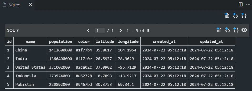
Alternatively, use whatever GUI tool you have installed, or run the following SQL query to confirm that the "countries" table has been seeded:

SELECT * FROM countries;

Create the application's core controller

To generate the controller, run the following command:

php artisan make:controller CountryController

Next, open the CountryController.php file you just created (located in app/Http/Controllers/) and update it to match the code below:

<?php

namespace App\Http\Controllers;

use App\Models\Country;

class CountryController extends Controller
{
    public function index()
    {
        return Country::all([
        	'color',
        	'latitude',
        	'longitude',
        	'name',
        	'population',
        ]);
    }
}

This controller is responsible for handling HTTP requests related to the Country model.

Define the routing table

The routing table defines the various endpoints of your application, specifying which functions and views are triggered when the URL is accessed. This routing table is essential for organizing and managing the flow of requests and responses, ensuring that your application can quickly retrieve data, present visualizations, and interact seamlessly with users. It facilitates clear navigation paths, optimizes server-client communication, and maintains a well-structured framework for handling and visualizing data throughout the application.

Now, run the following command to install the API route:

php artisan install:api

When shown the following prompt, answer with "yes":

One new database migration has been published. Would you like to run all pending database migrations? (yes/no) [yes]:

Next, navigate to routes/api.php and add the following code to the end of the file:

Route::get('/countries', [\App\Http\Controllers\CountryController::class, 'index']);

With this route, when a GET request is sent to the /countries endpoint, the index() method of the CountryController is invoked. This method retrieves the specified columns (name, population, latitude, longitude, and color) for all records in the countries table, and returns the data as a JSON response.

Install D3.js

D3.js, or Data-Driven Documents, is a powerful JavaScript package that allows you to create dynamic, data-driven visualizations. D3.js empowers you to craft highly customizable and dynamic data visualizations using Scalable Vector Graphics (SVG), HTML5, and Cascading Style Sheets (CSS).

To get started with the installation process, run the following command:

npm install d3

Create the view

To create the view, navigate to resources/views/welcome.blade.php and update it to match the following code:

<!DOCTYPE html>
<html lang="{{ str_replace('_', '-', app()->getLocale()) }}">
<head>
    <meta charset="utf-8">
    <meta name="viewport" content="width=device-width, initial-scale=1.0">
    <title>Top 5 Most Populated Countries</title>
    <script src="https://d3js.org/d3.v6.min.js"></script>
    <script src="https://d3js.org/topojson.v1.min.js"></script>
    <link rel="stylesheet" href="{{ asset('css/style.css') }}">
</head>
<body>
    <h1>Top 5 Most Populated Countries</h1>
    <div id="pie-chart"></div>
    <div id="bar-chart"></div>
    <div id="map-container">
        <div id="map"></div>
    </div>
    <script src="{{ asset('js/chart.js') }}"></script>
</body>
</html>

Now, let's style the interface. Start by creating a new directory called css within the public directory. Inside this directory, create a new file named style.css. Then, paste the following code into it:

body h1 {
    text-align: center;
}
#pie-chart,
#bar-chart,
#map {
    margin: 20px;
    display: inline-block;
}
#map {
    background-color: #36399b;
    border: 1px solid #ccc;
    width: 960px;
    height: 500px;
}
#map-container {
    width: 100%;
    height: 500px;
    display: flex;
    justify-content: center;
    align-items: center;
}
.tooltip {
    position: absolute;
    text-align: center;
    width: 100px;
    height: auto;
    padding: 5px;
    font: 12px sans-serif;
    background: lightsteelblue;
    border: 0px;
    border-radius: 8px;
    pointer-events: none;
}
.axis path,
.axis line {
    fill: none;
    stroke: black;
    shape-rendering: crispEdges;
}

Implement data visualization with D3.js

To integrate D3.js, create a new directory named js within the public directory. Inside the newly created js directory, create a file named chart.js. Then, add the following code to the file:

async function fetchData() {
    const response = await fetch("/api/countries");
    const data = await response.json();
    return data;
}

Next, add the following code to create the pie chart:

function createPieChart(data) {
    const width = 500,
        height = 500,
        radius = Math.min(width, height) / 2;
    const svg = d3
        .select("#pie-chart")
        .append("svg")
        .attr("width", width)
        .attr("height", height)
        .append("g")
        .attr("transform", `translate(${width / 2},${height / 2})`);
    const pie = d3.pie().value((d) => d.population);
    const arc = d3
        .arc()
        .outerRadius(radius - 10)
        .innerRadius(0);
    const arcHover = d3.arc().outerRadius(radius).innerRadius(0);
    const tooltip = d3
        .select("body")
        .append("div")
        .attr("class", "tooltip")
        .style("opacity", 0);
    const g = svg
        .selectAll(".arc")
        .data(pie(data))
        .enter()
        .append("g")
        .attr("class", "arc");
    g.append("path")
        .attr("d", arc)
        .style("fill", (d) => d.data.color);
    g.append("text")
        .attr("transform", (d) => `translate(${arc.centroid(d)})`)
        .attr("dy", "0.35em")
        .attr("text-anchor", "middle")
        .text((d) => d.data.name)
        .style("fill", "#fff")
        .style("font-size", "12px");
    g.on("mouseover", function (event, d) {
        d3.select(this)
            .select("path")
            .transition()
            .duration(200)
            .attr("d", arcHover);
        tooltip.transition().duration(200).style("opacity", 0.9);
        tooltip
            .html(
                `${d.data.name}:<br>Population: ${
                    d.data.population
                }<br>Percentage: ${(
                    (d.data.population / getTotalPopulation(data)) *
                    100
                ).toFixed(2)}%<br>Latitude: ${d.data.latitude}<br>Longitude: ${
                    d.data.longitude
                }`
            )
            .style("left", event.pageX + 5 + "px")
            .style("top", event.pageY - 28 + "px");
    }).on("mouseout", function () {
        d3.select(this)
            .select("path")
            .transition()
            .duration(200)
            .attr("d", arc);
        tooltip.transition().duration(500).style("opacity", 0);
    });
    function getTotalPopulation(data) {
        return data.reduce((acc, d) => acc + d.population, 0);
    }
}

The provided code creates a pie chart visualization. It utilizes D3.js for pie layout calculations, arc generators to define slice shapes, tooltips to display additional information on hover, and helper functions that enhance interactivity and improve the visual presentation of data.

Now, add the following code to your chart.js file to create a bar chart:

function createBarChart(data) {
    const width = 500,
        height = 500,
        margin = { top: 20, right: 30, bottom: 40, left: 40 };
    const svg = d3
        .select("#bar-chart")
        .append("svg")
        .attr("width", width + margin.left + margin.right)
        .attr("height", height + margin.top + margin.bottom)
        .append("g")
        .attr("transform", `translate(${margin.left},${margin.top})`);
    const xScale = d3
        .scaleBand()
        .domain(data.map((d) => d.name))
        .range([0, width])
        .padding(0.1);
    const yScale = d3
        .scaleLinear()
        .domain([0, d3.max(data, (d) => d.population)])
        .nice()
        .range([height, 0]);
    svg.append("g")
        .attr("class", "x axis")
        .attr("transform", `translate(0,${height})`)
        .call(d3.axisBottom(xScale));
    svg.append("g")
        .attr("class", "y axis")
        .call(d3.axisLeft(yScale).ticks(10, "s"));
    const tooltip = d3
        .select("body")
        .append("div")
        .attr("class", "tooltip")
        .style("opacity", 0);
    svg.selectAll(".bar")
        .data(data)
        .enter()
        .append("rect")
        .attr("class", "bar")
        .attr("x", (d) => xScale(d.name))
        .attr("y", (d) => yScale(d.population))
        .attr("width", xScale.bandwidth())
        .attr("height", (d) => height - yScale(d.population))
        .style("fill", (d) => d.color)
        .on("mouseover", function (event, d) {
            d3.select(this).transition().duration(200).style("fill", "orange");
            tooltip.transition().duration(200).style("opacity", 0.9);
            tooltip
                .html(
                    `<strong>${d.name}</strong><br>
                    Population: ${d.population}<br>
                    Percentage: ${(
                        (d.population / getTotalPopulation(data)) *
                        100
                    ).toFixed(2)}%<br>
                    Latitude: ${d.latitude}<br>
                    Longitude: ${d.longitude}`
                )
                .style("left", event.pageX + 5 + "px")
                .style("top", event.pageY - 28 + "px");
        })
        .on("mouseout", function (d) {
            d3.select(this)
                .transition()
                .duration(200)
                .style("fill", (d) => d.color);
            tooltip.transition().duration(500).style("opacity", 0);
        })
        .on("click", function (event, d) {
            d3.selectAll(".bar").style("fill", (d) => d.color);
            d3.select(this).style("fill", "red");
        });
    function getTotalPopulation(data) {
        return data.reduce((acc, d) => acc + d.population, 0);
    }
}

The code above creates an interactive bar chart visualization using D3.js. It leverages scaling functions ( scaleBand and scaleLinear) to map data to visual attributes, constructs axes to provide context and readability and adds interactive elements (rectangular bars) with dynamic color changes and tooltips to enhance data insights.

Next, add the following code to your chart.js file to create the map visualization:

async function createMap(data) {
    const width = 960,
        height = 500;
    const projection = d3
        .geoMercator()
        .scale(150)
        .translate([width / 2, height / 2]);
    const path = d3.geoPath().projection(projection);
    const svg = d3
        .select("#map")
        .append("svg")
        .attr("width", width)
        .attr("height", height);
    const tooltip = d3
        .select("body")
        .append("div")
        .attr("class", "tooltip")
        .style("opacity", 0);
    try {
        const world = await d3.json("https://d3js.org/world-50m.v1.json");
        svg.selectAll("path")
            .data(topojson.feature(world, world.objects.countries).features)
            .enter()
            .append("path")
            .attr("d", path)
            .style("fill", function (d) {
                const countryData = data.find(
                    (country) => country.name === d.properties.name
                );
                return countryData ? countryData.color : "#ccc"; // Default color if not found
            })
            .style("stroke", "#fff")
            .style("stroke-width", 0.5)
            .on("mouseover", function (event, d) {
                const countryData = data.find(
                    (country) => country.name === d.properties.name
                );
                d3.select(this).style("opacity", 0.7);
                tooltip.transition().duration(200).style("opacity", 0.9);
                tooltip
                    .html(
                        `
                    <strong>${d.properties.name}</strong><br>
                    Population: ${countryData.population}<br>
                    Percentage: ${(
                        (countryData.population / getTotalPopulation(data)) *
                        100
                    ).toFixed(2)}%<br>
                    Latitude: ${countryData.latitude}<br>
                    Longitude: ${countryData.longitude}
                `
                    )
                    .style("left", event.pageX + 5 + "px")
                    .style("top", event.pageY - 28 + "px");
            })
            .on("mouseout", function () {
                d3.select(this).style("opacity", 1);
                tooltip.transition().duration(500).style("opacity", 0);
            });
        svg.selectAll("circle")
            .data(data)
            .enter()
            .append("circle")
            .attr("cx", (d) => projection([d.longitude, d.latitude])[0])
            .attr("cy", (d) => projection([d.longitude, d.latitude])[1])
            .attr("r", (d) => Math.sqrt(d.population) / 1000)
            .style("fill", (d) => d.color)
            .style("opacity", 0.7)
            .on("mouseover", function (event, d) {
                d3.select(this)
                    .transition()
                    .duration(200)
                    .attr("r", Math.sqrt(d.population) / 800);
                tooltip.transition().duration(200).style("opacity", 0.9);
                tooltip
                    .html(
                        `
                    <strong>${d.name}</strong><br>
                    Population: ${d.population}<br>
                    Percentage: ${(
                        (d.population / getTotalPopulation(data)) *
                        100
                    ).toFixed(2)}%<br>
                    Latitude: ${d.latitude}<br>
                    Longitude: ${d.longitude}
                `
                    )
                    .style("left", event.pageX + 5 + "px")
                    .style("top", event.pageY - 28 + "px");
            })
            .on("mouseout", function () {
                d3.select(this)
                    .transition()
                    .duration(200)
                    .attr("r", Math.sqrt(d.population) / 1000);
                tooltip.transition().duration(500).style("opacity", 0);
            });
    } catch (error) {
        console.error("Error loading map data:", error);
    }
    function getTotalPopulation(data) {
        return data.reduce((acc, d) => acc + d.population, 0);
    }
}
fetchData().then((data) => {
    createPieChart(data);
    createBarChart(data);
    createMap(data);
});

The code above fetches data and creates an interactive world map visualization. It displays countries and their associated data, including name, population, latitude, longitude, and percentage. The visualization is created dynamically after the data is successfully retrieved.

Test the application

To test the application, openhttp://127.0.0.1:8000 in your browser. You will see the pie chart, bar chart, and map data visualizations as shown below:

That's how to create a Dynamic Data Visualization in Laravel with D3.js

The impact of interactive data visualization is outstanding. It enables you to access valuable information more frequently, enhancing decision-making and minimizing reliance on hunches and guesses in time-sensitive situations.

This tutorial demonstrated how to dynamically visualize the top five most populous countries using pie charts, bar charts, and an interactive map, integrated within Laravel and rendered using D3.js.

This approach can be extended to various datasets and visualization types, allowing you to present data in ways that are both informative and visually appealing. As you continue to explore and utilize these tools, you'll be able to create even more sophisticated and impactful data visualizations. Happy coding!

Lucky Opuama is a software engineer and technical writer with a passion for exploring new tech stacks and writing about them. Connect with him on LinkedIn.